Paired Samples T-test
If you have arrived here, you either know what you are looking for and I’m assuming you understand the basic concepts of the T-test. If you do not have a clear understanding of what a T-test describes then please visit this page.
Now that you understand what a T-test is, a natural question you may have is: what if I am in the situation where observations in one my samples can be paired with an observation in the other sample? Here are some examples of such situations:
- Measurements taken on an individual before and after a particular treatment (performance before and after a training program)
- Measurements taken under 2 different conditions (reaction time of an individual on two particular drugs)
Additionally, there are some important assumptions when choosing to use a paired samples T-test:
- The participants should be selected randomly from the population.
- The differences between the pairs should be normally distributed.
- There should be no extreme outliers in the differences.
The null hypothesis of a T-test is that the means between the two groups are the same.
The alternative hypothesis of a T-test is that the means between two groups are different.
An important point to keep in mind is the whether you intend on using a one-tailed or two-tailed T-test. A one-tailed T-test looks for either a directional (increase or decrease) change in the mean while a two tailed T-test just looks for a change (could be an increase OR a decrease).
Values needed to conduct a paired samples T-test
To conduct a T-test using JMP, Excel, or R, you will need your data points recorded in two columns; one column for each treatment. The data for this analysis should be numeric. Then conduct the analysis by specifying which column corresponds to which group.
Here is an example of how your data should be formatted:
| Subject No. | Reaction Time pre (ms) | Reaction Time post (ms) |
|---|---|---|
| Subject 1 | 168 | 148 |
| Subject 2 | 170 | 150 |
| Subject 3 | 175 | 160 |
| Subject 4 | 170 | 152 |
| Subject 5 | 172 | 155 |
| Subject 6 | 173 | 158 |
| Subject 7 | 177 | 156 |
| Subject 8 | 178 | 159 |
| Subject 9 | 171 | 151 |
Values returned from a T-test
The T-test will produce the following values. I have provided a brief description of how to interpret them.
- degrees of freedom: (sample size - 1) the number of values that have the freedom to vary in the dataset.
- T-score: the ratio between the difference between two groups and the difference within the groups. A larger T-score indicates a larger difference between the groups than within the groups. A smaller T-score indicates a larger difference within the group than between the groups.
- P-value: the probability that the results from your sample occurred by random chance. Important note: the p-value does not indicate that the treatment is the CAUSE. All that it states is that the two means are significantly different from each other.
- P-value < 0.05 indicates the means of each group are different from each other (Reject the null hypothesis)
- P-value > 0.05 indicates that you cannot conclude that means of each group are different from each other (Fail to reject the null hypothesis)
Visualizing the results
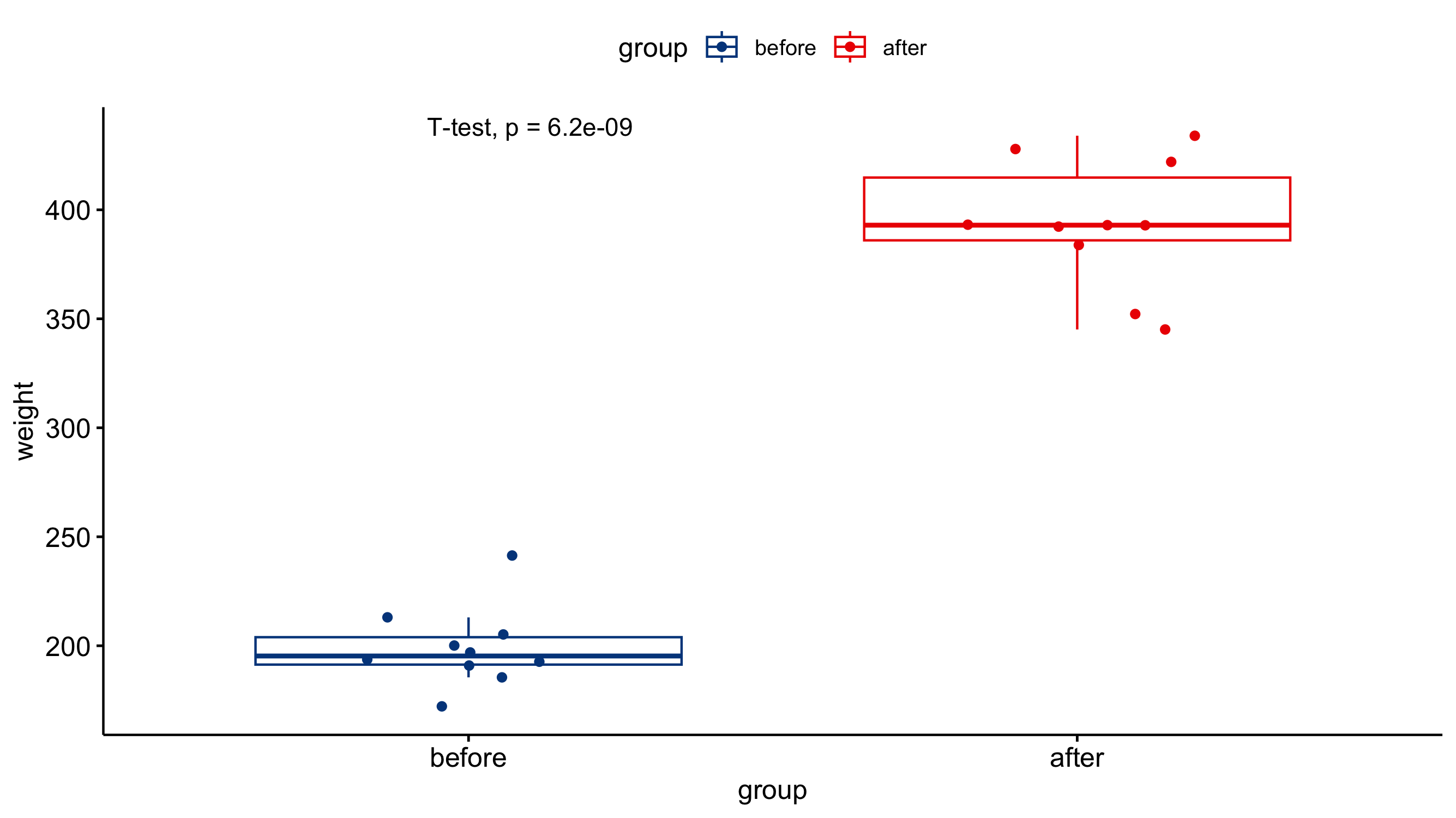
Just because you ran the analysis in JMP does not mean you have to use JMP to visualize your results. As long as you have a statistically significant result you can generate the plots however you would like (e.g., Excel, Google Sheets, R, Python). All you need to do is add an annotation to the figure that the P-value was < 0.05. A box-and-whisker plot would be a good way of visualizing the results of a T-test. The box-and-whisker plot would present both the spread of the data while also incorporating error bars associated with the mean calculation.
