Pearson’s correlation
Pearson’s correlation, also known as the Pearson correlation coefficient, is a statistical measure that determines the strength and direction of a linear relationship between two continuous variables. It is represented by the symbol “r”.
Do not confuse this “r” with “r^2”; these are different values.
Pearson’s “r” refers to identify correlation while “r^2” is a way to quantify model fit of a linear regression or General Linear Model.
This type of statistic is necessarily a hypothesis test but it is a good way to quantify the relationship between two variables.
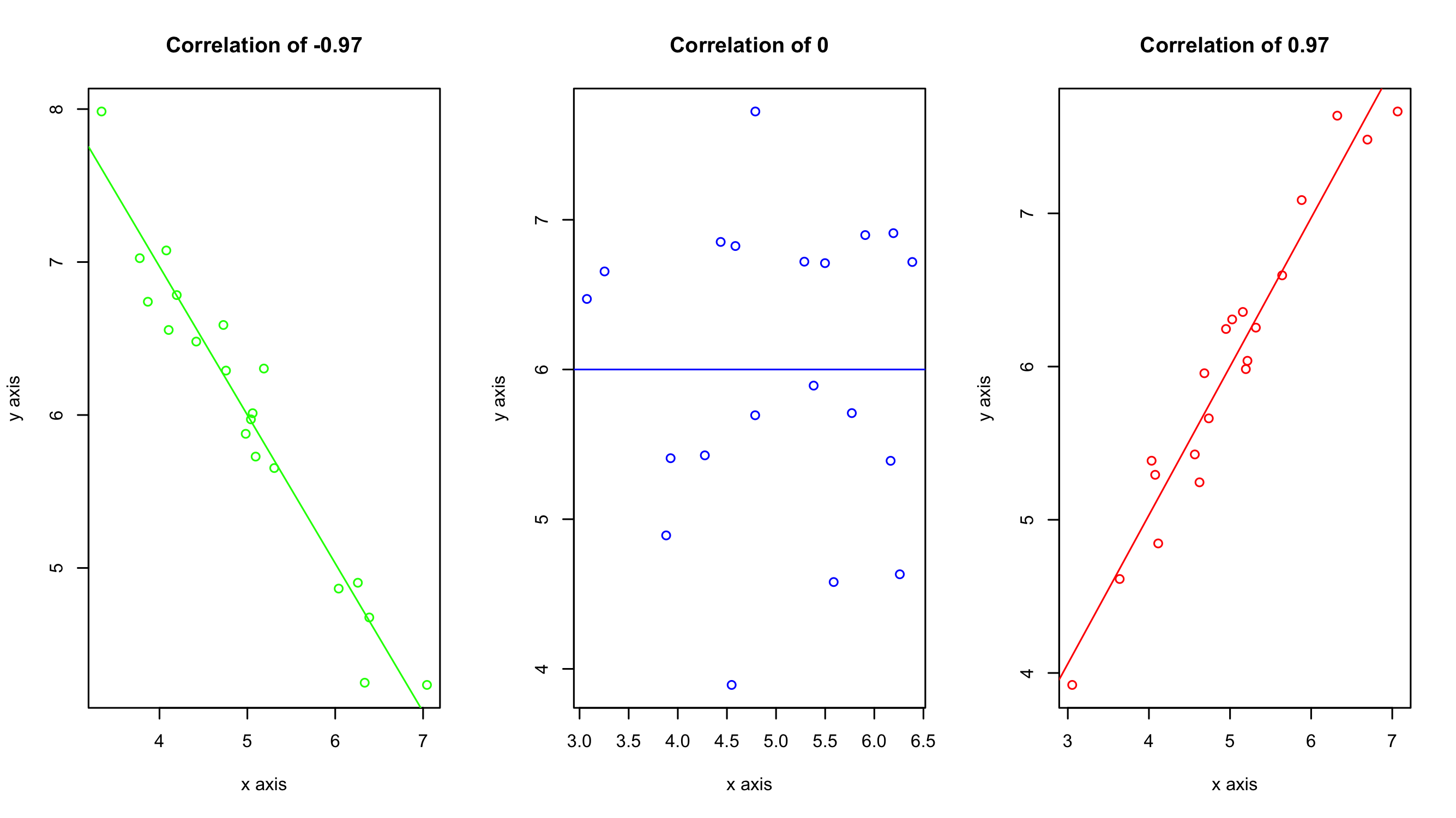
The Pearson correlation coefficient can range from -1 to +1. A value of -1 indicates a perfect negative correlation (when one variable increases, the other decreases), while a value of +1 indicates a perfect positive correlation (when one variable increases, the other also increases). A value of 0 indicates no correlation between the variables.
As a general rule of thumb use the following cut offs to determine the strength of the observed relationships:
- Perfect: If the value is near ± 1, then it said to be a perfect correlation: as one variable increases, the other variable tends to also increase (if positive) or decrease (if negative).
- High degree: If the coefficient value lies between ± 0.50 and ± 1, then it is said to be a strong correlation.
- Moderate degree: If the value lies between ± 0.30 and ± 0.49, then it is said to be a medium correlation.
- Low degree: When the value lies below + .29, then it is said to be a small correlation.
- No correlation: When the value is zero.

Example of when and how to use a Pearson’s correlation
Let’s say you want to know if there is a correlation between the number of cups of coffee you drink per day and words per minute when typing. You start tracking your coffee intake and words per minute for 10 days.
| Cups of Coffee | Words per Min |
|---|---|
| 1 | 80 |
| 2 | 90 |
| 3 | 100 |
| 4 | 110 |
| 3 | 100 |
| 2 | 90 |
| 6 | 130 |
| 5 | 120 |
| 6 | 130 |
| 7 | 140 |
The Pearson’s correlation comes out to be r = 1.0, which is a perfect positive correlation. This means that as the number of cups of coffee you drink per day increases, your productivity level also increases in a linear fashion.
However, before you go overboard and start drinking 10 cups of coffee a day, it’s important to remember that correlation does not always equal causation! It’s possible that other factors, such as sleep quality or workload, could be affecting your productivity as well.
Visualizing the results
Just because you ran the analysis in JMP does not mean you have to use JMP to visualize your results. As long as you have a statistically significant result you can generate the plots however you would like (e.g., Excel, Google Sheets, R, Python). All you need to do is add an annotation to the figure that has the r value displayed. A scatter plot would be a good way of visualizing the results of a Pearson’s correlation test. The scatter plot would present both the spread of the data while also incorporating, throwing a line of best fit in the mix may also help the audience see the relationship.
